
-by Michael Penner, Owner FlexTech Media

Complexity happens. It sounds like a t-shirt, but it’s true. Well organized websites are often reinforced by intuitive navigation. They are perceived as less complicated than websites that have lots of confusing navigation options to reach content tucked away in the backwaters of the user interface. If the content on the website is not logically organized, then it will be difficult to create an intuitive navigation experience for desktop users, but especially for mobile users. At least with desktop visitors you get a lot of screen space to work with so you can have three levels of drop-down navigation menus along with sidebar navigation to provide yet a fourth level. But on mobile, it’s an entirely different ball of hair.
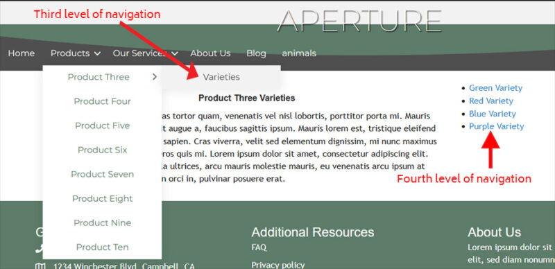
There can be many reasons navigation complexity arises, and sometimes it’s just not avoidable. No matter how complex the navigation has to be, the simplest presentation is always best. The above navigation scenario might indeed be the simplest navigation solution possible given the requirements, but it won’t work on mobile.
When I say mobile, I mean phones, not tablets, and I mean viewing the website in portrait orientation.
When mobile gets involved, several things happen:
- Your sidebar either disappears or is re-positioned at the top or bottom of the page.
- Your main menu navigation is rolled up into the hamburger menu and positioned somewhere in the page header.
- Your navigation scrolls away from view faster, forcing the visitor to scroll back to the top of the page every time they want to inspect or use the navigation.
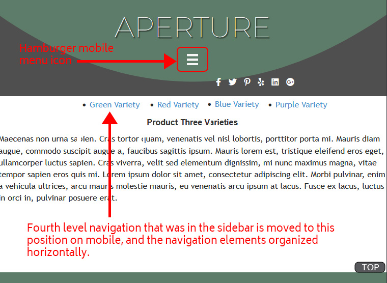
For the sidebar navigation elements, if the sidebar is acting as third or fourth level navigation, then that sidebar most likely should go at the top, just beneath the page header. When you do this, you’re impacting the aesthetic of the design. It’s the classic “function vs. form” situation. You can see that what was fine for the sidebar doesn’t look so good in the image above.
The main menu is now hidden inside the hamburger icon. You can have this icon follow your scrolling, floating in a fixed position along the side of the screen, or better, you could have a small “back to top” button floating near the bottom of the screen. In the graphic above, I just show it saying “TOP” in the lower right corner. It’s a great idea to have such a button regardless. It makes navigating long pages a lot easier and reduces scrolling fatigue.
When it comes to additional levels of navigation, stacking such navigation above the content area and just below the header is usually the simplest approach.
Well organized content makes it much easier to create intuitive navigation. No matter how complex your navigation, as long as you arrange it and present in a logical manner, visitors will perceive less complexity along with having a better information seeking experience.