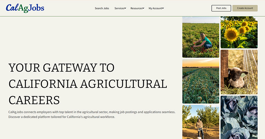
The graphic design for the website at https://calagjobs.com was created using Relume then hand-coded into a responsive website. It has multiple secure workflows such as a job posting and payment workflow, candidates applying directly through the system for work, employers receiving and managing applications, and much more. This year I completed a major overhaul of both their design and functionality. The result is a website that looks and behaves like a modern system that is also secure.
The revamped website was developed on a protected staging server that brought with it some challenges when moving the design onto the live site. The live site never stops taking new sign-ups, posting new jobs, taking payments and recording payment history, and other highly dynamic daily activities. So, in order to implement the new design over the live site required careful planning for minimum downtime.
UX Of Interest
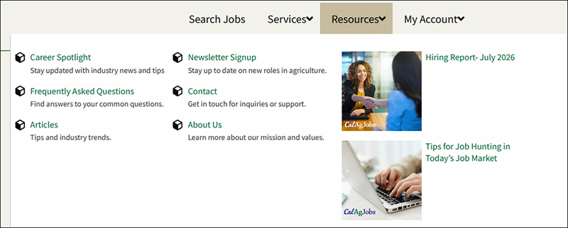
For this website, I went with a mega menu approach to provide a more compact display than a multi-tiered menu system alone could provide. When Resources is hovered, the mega menu appears. This menu combines both posts and pages as destinations. I’ve implemented it in a manner that makes it possible for the content manager to manipulate.
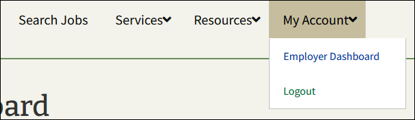
There are two end user roles used by this website: employer and candidate. These roles require their own navigation elements under My Account. When not logged in as either an employer or candidate, the only option under My Account is Login. But when logged in as an Employer we see the Employer Dashboard option. It is likewise for a logged in Candidate account.
On the home page, I created an infinite scroller using only CSS. Again, this was created in a manner that allows a non-technical content manager to update the images it contains. The scroller hugs the height of the section it resides within. Each strip is independent of the other and scroll speeds can be independently set.

But this won’t work great on mobile, and could be considered annoying within such a small amount of screen space. Here’s how this same section appears on mobile:
The non-technical content manager has absolute control over what goes into this section based on display port.
On mobile I had to make decisions about how to promote the most desired actions without burying them in the mobile navigation itself. I decided to preserve the display of two buttons beneath the hamburger menu; Post Jobs and Create Account.
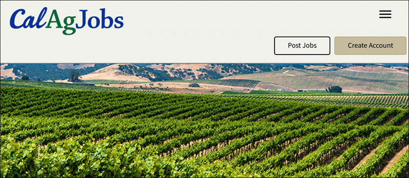
Account sign up and login has several possible paths. A person can sign-up for an employer or candidate account, or log right in. Password recovery is also initiated from this screen. It is also important the the Terms and Conditions agreement is prominently placed near the login badge. I also wanted to create iconography that could be used throughout the site to denote if one is logged in as an employer or candidate, and came up with the stylistic blue and green circles containing a human outline in them. I went with a functional description for each which tells what each account is capable of doing. I styled the login page and used PHP code to inject the Terms and Conditions link, as well as laying out the page.
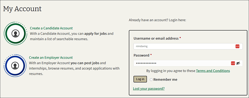
Both employers and candidate accounts have a dedicated dashboard they arrive at once they login. These dashboard contain features interesting to that role. I wanted to make it as simple as possible for users to perform certain actions without having to constantly refer to the main menu navigation. Both dashboards are presented below. You can see the buttons I’ve positioned above the dashboard content to keep the experience intuitive. I designed and coded these dashboards to match the website’s design.
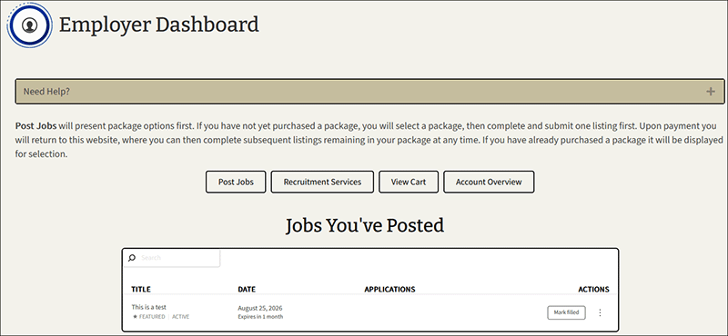
Each dashboard contains a “Need Help?” bar that opens a web form for submission that then alerts staff. I decided to this rather than linking out to a Contact Us page or other external destination. Providing instructions at the top of the dashboard lets users know what to expect when they click on Post Jobs. Posting a job is it’s own workflow with its own set of screens and UX considerations as shown below.
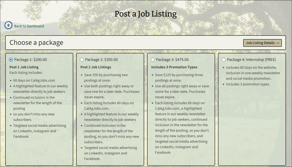
I made heavy use of CSS to create this layout for the job posting package selection screen. The “Back to Dashboard” option lets them quickly retreat from the workflow. I created the page design and the panel layout for each package. By using a prominently placed radio button on the same line as the package name and price, it makes it easy for employers to know what they are selecting. This is a monetized job board, and so the end user needs to be able to adjust the prices as they change; which they can do based on the way I designed and implemented this page.
The system is setup to only allow an Employer account to post a job, and only allow a candidate account to apply for a job. Once an employer selects a job package, the next screen lets them enter the job details, checkout their cart, and pay for the job. The system then sends the employer a confirmation e-mail with CalAgJobs staff approves the listing.
The job listings themselves required several on-screen considerations. A filter, a way for a candidate to add a job alert to their dashboard, and a filter for jobs of type “Western Growers Next Generation” .
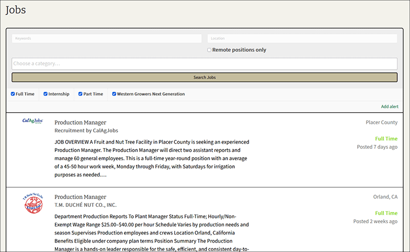
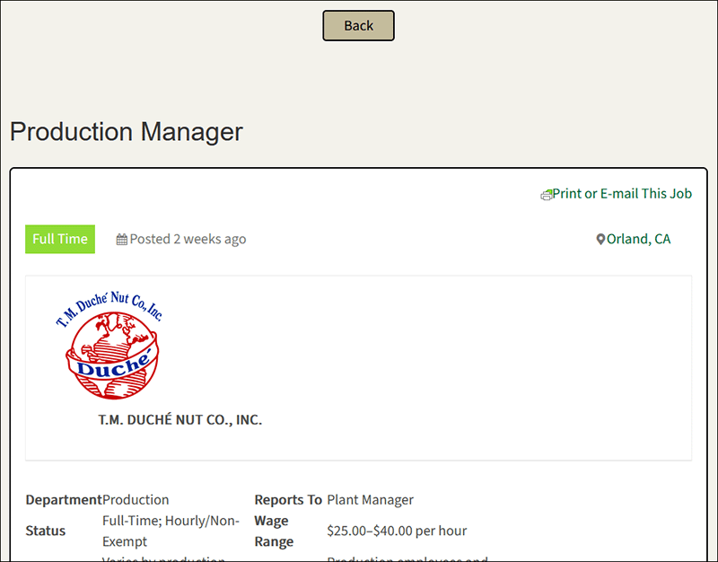
The job details screen clearly displays a back button for quickly escaping the sequence, the type of job (Full Time), when posted (2 weeks ago), the ability to print or e-mail the job (required the implementation of separate CSS stylesheet), the logo, and finally the rest of the job information.