
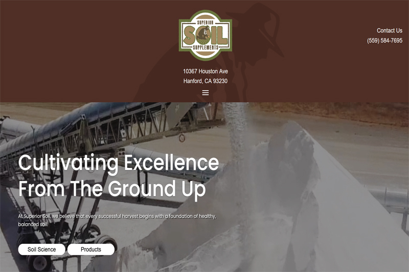
I designed this website from an inspiration board Cecil Lopez of Red Chair Marketing provided, and managed the content reviews and placement. This website is fully responsive, with extensive UI work. Colors, fonts, and layouts were all derived from the inspiration boards. Web fonts were converted to local fonts to improve performance. I optimized the video Cecil provided. As far as asset management during the build, I provided both the client and Cecil with access to a secure file sharing portal that is Zoho Workdrive.
The design was first reviewed in UXPIN and with videos I made showing every responsive aspect I addressed. This assured the client knew exactly what they were getting without them having to look at it themselves on all their mobile devices…though spot tests by them were still required before I would call a design ready to go.
I created a user guide so that a non-technical person could not only updated the written content and images, but also so such a person could handle the conditional display of the movie on the home page vs. a static image that works better on mobile. The guide contains all image sizes standardized through the website. The client has administrator access to the backend and the hosting I provided for this website through baremetal.ca.
A protected staging site is also maintained. This allows system updates to be verified there first before updating the same on the live site. This website is cared for through my Site Maintenance and Security Hardening service. Staging also gives my client the ability to practice content updates without harming the live site. Both sites are backed up daily, and hardened through a variety of techniques i employ.