

The same image can impact ten people in ten different ways, with varying degrees of effect. This is why creative professionals ask a lot of questions they hope will help them access the same headspace as their clients. And while some web projects might have a budget for professional photography, the vast majority of clients will get their images from a repository such as dreamstime.com.
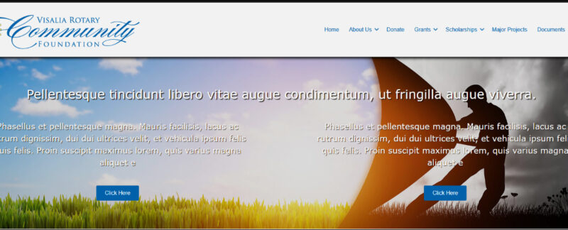
Sometimes the needed imagery is easy to envision and appeals to the client when they see it in the context of a design and not on its own. The image at the top of this article could be a sunrise or sunset, depending on how it is used on a website. This was the image I used as the basis for the page header background at https://vbrotary.org. The assumption here is that this is a sunrise. If this had been the background for the page header of a funeral home website, people would perceive a sunset.
The message of the image is its power. Still, sometimes a designer like myself gets caught up in the potential symbolism and becomes momentarily blind to the actual first impression of the image. It’s a danger that comes from spending too much time looking at the same image and manipulating it while reading the same notes repeatedly. Once in a great while, it just backfires.
The draft image below was was meant to represent how my client’s organization empowered individuals to make a difference, breathing new life and hope into the local community.
My client saw…a windsurfer. After they pointed that out, it’s all I could see too!
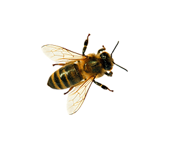
Understanding the client means having at least a surface familiarity with their core value, the problem they solve, and how they fit within their industry. When I’m writing web copy that’s the very least I have to know. When I’m designing the website, it’s usually sufficient. For instance, when depicting organic agricultural concepts, the presence of a bee on a blossom is considered a sign that harmful chemicals (however that is defined) are absent. For the website https://pasafarms.com, we couldn’t locate a stock image that conveyed just the right message. So, I added a bee to the image of strawberries (among other manipulations) to promote a message of organic health to the intended audience.


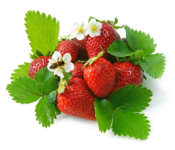
It might seem a bit too subtle, but the research that goes into a simple image modification like this suggests the intended audience will indeed pick up on the message some of the time. Indeed, the client confirmed it.
When it comes to the images your website uses, be picky and take your time. The professionalism of your website and the perceived value of your message are enhanced in the visitor’s mind when this part is done right.