
Workflow diagrams map use cases into a coherent visual story, providing far more context than mere bullet points in text. The trick is to keep the diagram simple, and this requires evaluating what the reader brings to the table. One person’s “simple” can be another’s “confusing”. Too much information can be a bad thing when it comes to explaining processes. Likewise, if the workflow has branching logic, or simultaneous events (common), the job of keeping it simple gets harder. However, there are a few universal rules that can help:
- Complexity is the enemy, and it is everywhere. Getting to simple is the goal, and it can require a lot of work. When you’re done, it might look like you didn’t do much at all to create the diagram. You’ve succeeded when it becomes intuitively obvious what’s going on just by looking at the diagram and reading legend text.
- Keep the chart elements adequately spaced apart and font type variation (bold, italic, colors, etc…) to a strict minimum.
- Use the design principle of negative space to suggest groupings of elements without having to draw actual lines between them; lines add to visual complexity.
- Unless you are charting complex logic with database read/write activity, passing variables between functions, or other software behaviors, you should be able to keep the number of shapes used to construct the diagram to a minimum.
- Flowcharts and workflows are read with the “Yes” or “positive” flow leading down the page. A “No” branches off horizontally to another shape or set of shapes. If the “no” answer doesn’t result in anything significant to consider, you can probably omit it. This allows you to limit horizontal paths and the need for additional shapes (like a circle with a letter in it).
- Some events might trigger multiple, simultaneous actions by the system. These need to be included in the diagram. To add to the fun, different users types for these event driven system responses can be important to clarify as well. Just like conditional logic requires branching the diagram, the requirement to identify multiple user types (such as system administrators or end-users) within the diagram imposes more complexity. Perhaps we branch off into another diagram cluster next to the main diagram, or maybe it’s possible to find a way to avoid that without cramping up the main diagram. This is where good graphic design skills serve well.
- The Marketing Department needs this as an Infographic. It will provide a surface treatment of the process using creative design approaches for telling the user story.
- The Operations Department needs a technically insightful visual resource. This is an audience that needs to understand how the user story is fulfilled.
Let’s take a look at two diagrams, each concerned with the same goal: a predictable, positive experience interacting with a web design agency. This Infographic is what website visitors see:
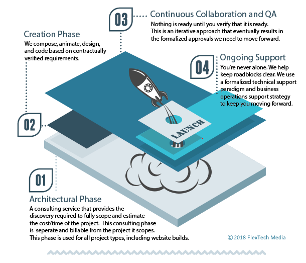
Figure 1: The Infographic
In this use case, several main workflows that run the agency are presented as the ideal outcomes (benefits) of a phase. Each phase is seen as a layer, rather than a step, through which the project must pass before the website can be launched. The virtue of speed is communicated graphically, as is the implied promise of a smooth, structured project experience. These diagrams require more artistic skills than their technical counterparts, and a lot of imagination to determine what sort of metaphor will connect best with the client-audience. This is where technical writing and marketing converge to tell the story and communicate value.
For operations, the actual workflows behind the scenes required to deliver the optimal customer experience need to be consistently applied. This usually focuses on software workflows for completing administrative tasks such as we see here:
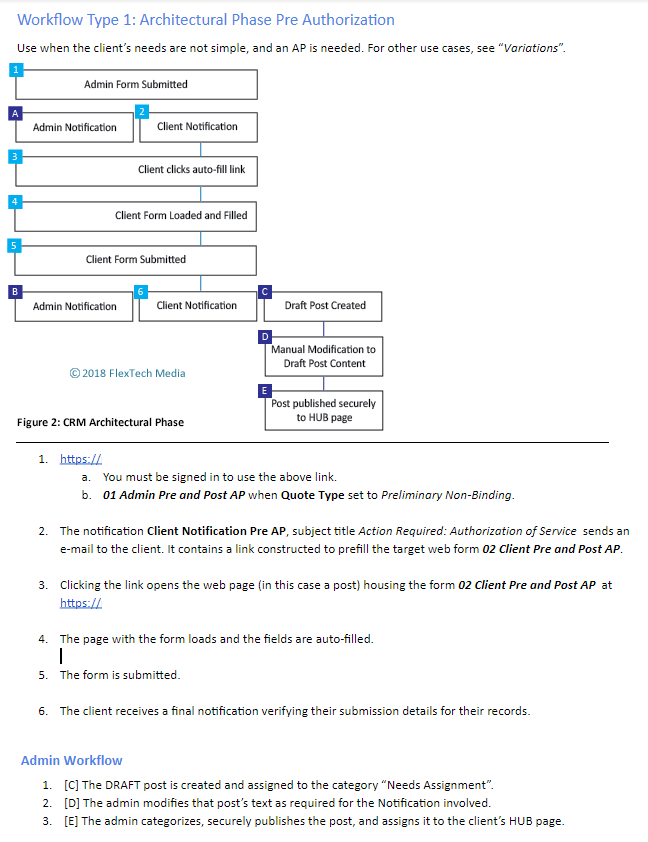
In this use case our audience is internal company employees. This document is also useful for identifying the type of CRM software required to run the company, or what would need to be developed if nothing off-the-shelf will do.
The graphic uses only one shape: a rectangle. It uses no branching logic and progress flows from top to bottom as in a traditional flowchart. A blue line connects the end-user related experience, while the colored boxes with either letters or numbers naturally delineates the admin experience from the end-user experience. Simultaneous events are visually implied by occupying the same row together.
One can easily see how the promise made to the clients is expected to be fulfilled by employees. As it turns out, Figure 2 is the same pattern that works for several other back-office workflows, including the process for taking and tracking Change Requests.
Why It Matters In The End
Diagramming the internal processes that are supposed to deliver the optimum customer experience can provide a more intuitive frame of reference for comparing how you are doing things with what you are promising. Consistent results are easier to achieve with methods that are not mired in complexity. Even then, the more someone understands a thing, the less complex it is perceived to be. Good diagrammatic information can communicate a lot of high level information accurately, and clarify other details in a way words alone cannot. Keeping these diagrams as simple as possible for the intended audience, without losing the required level of resolution, makes them invaluable visual resources.